
Pass the Page
Industry
UX/UI Design
Date
Spring 2026
Pass the Page was a collaborative group project completed as part of UX450. In this project, I focused on prototyping, design execution, and developing presentations to communicate our work effectively.
The Problem
As AI becomes increasingly integrated into children’s games, it offers powerful tools for generating ideas and content. However, over-reliance on AI risks diminishing children’s ability to think creatively and engage in imaginative play. This creates a design challenge: how might we incorporate AI into a children’s game in a way that supports and enhances creativity, rather than replacing it?
The Solution
Pass the Page uses AI to enhance creativity, not to replace it. Pass the Page is a children's/family game that involves collaborative drawing. At the end of the game, an integrated AI generates a story based on the created drawing and user input. Overall, Pass the Page aims to create a fun, creative experience that families can enjoy together.
Meet Our Users
Our target audience is families with young children; specifically, children ages 3-12. When designing Pass the Page, we targeted it towards young children. Because if young children can understand it, then the rest of our target audience will be able to as well.
User Personas


Design System Iteration One
For our original design system, we chose a bright, simple color palette, easy-to-read fonts, and utilized a bunny for the main mascot. I personally designed the logo and decided to create several variants.

Wireframes
After establishing a design system, we began creating wireframes. These low-fidelity wireframes guided the beginning user flow and helped us begin to generate UI design ideas.

Alpha Prototype
After finishing the wireframes, we moved on to creating the first iteration of the prototype. This version of the prototype helped us see our ideas more clearly and provided insight into what improvements needed to be made.

Feedback
Since this project was created for a client, our client was our main source of feedback. Their main suggestions were to rework the color palette to fit the target audience better and to create a new mascot that matched the rest of the UI design.
Design System Iteration Two
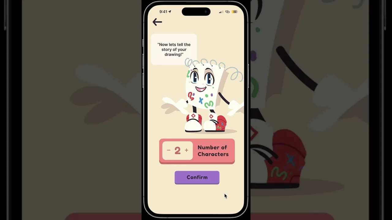
We sent our client several different color palette variations based on feedback, and implemented the chosen one into the new design system. We also added the new mascot– a notebook into the design system as well.

Beta Prototype
The second iteration of the prototype had major changes to the color palette and mascot. We also made a few changes to the functionality, as there were some errors in the prototyping.
Reflections
Overall, this project has taught me that designing for children looks a lot different than designing for an adult audience. The colors and font choices that I made were much different than some of my other projects.
I also gained more skills in rapid prototyping. The time between wire frames and the alpha prototype was a week or two; this timeline is a little bit faster than what I am used to, so that was an exciting challenge.


